Showing posts with label Unit 2. Show all posts

Sunday, 12 October 2014

Grayscale and Duo-Tone Contact Sheet

Some images are repeated because I flatted some of the images, thinking at the time I couldn't contact them unless they where saved as a j-peg. Also, I'm not sure if all of the images I changed are here in this contact sheet. In the future I need to organize my images better.


RGB/CMYK Grids and Conclusion


I did three of the RGB/CMYK grids because I wanted to show variety in my work. If I could help it I didn’t want to have too many repetitive themes in each column. One of the most re-accruing types of photos I used reflects my association with colour and nature. 


   Overall conclusion
Throughout this project I have come to realise that colour is a major factor in our everyday life, more than we realise. Colour plays a large part of our everyday lives either inadvertently or deliberately in our lives. We use colour to cover our flaws and to create a fake version of our naked selves. Colour can be used to enhance and extenuate our features in the hopes of attracting or hiding from the world around us. At our core we are all animals and colour effect our view and perception of the world around us. It’s how we interpret a situation and assess the environment around us. Colour can be used to express our inner selves, personalities and to some degrees our souls. Our daily lives are bombarded with advertisements to attract our attention and subconiousnessly affect our decisions in selecting products. The use of light in advertisements can be used to fool us into thinking that something is perfect or desirable. This project helped me to understand myself more in how the light and colour I surround myself with affects my mood on any specific day. I feel more awake seeing and feeling my surroundings in a spiritual way. I never really used to pay attention to the world around me before this project. This project made me think about the use of colour in nature to attract, warn and blend in with itself.
The composition of my images has improved throughout the project as I have become more aware of the components that compose my image. Ive learnt to move around move when composing an image to get the best prospective possible. i feel that I need to improve on my time keeping and to complete work as I get it not leaving it till later. I need to improve my attendance at college so I don’t fall behind or miss out on learning something new. I believe my project was a success as I got the result I was looking for. I have learnt to take into consideration what I want the viewer to see and feel. I found it kind of scary how you can use colour to subconsciously manipulate someone into feeling a certain way. By doing this project I have learnt to consider warm and cold colours within my photos as they can change the tone of an image. I really enjoyed this project and cant wait to use what I have learnt in future projects.

Object Task

Object Task 

For this task we were asked to photograph a variety of objects which were provided by our teachers. The objects ranged across the seven of the colours catorgies that we are currently observing. The outcome of this task was to take indiviudal photos of the objects or group them together in their specific colour catorgies. Out of all the photoshoots so far I feel that this collection were my weakest. I just couldn’t think of a way that I could capture the objects in an interesting way. So, I've picked the two images that I found the most interesting from the shoot to talk about. Overall I feel like perhaps I was having a bad day.

The way I interripated this task was that the objects in our daily lives could be a reflection of our interests and personality. Do we choose objects based on their colour? We use colour  to decorate and create ceratin atomspheres in our homes. That is why no one room is the same. I can even imagine that there are people out there that have rooms decorated souly in one colour. If I ever did this task again I would probably collect objects from my own home and place them in situation that reflect their use within the home. For example the yellow washing up gloves covered in soap. I definantly would like to do this task again but it would depend on if I had enough time. 


The colour in this image is very vibrant and bold. The earthy contrast of the wall helps the accentuate this.  I also like the contrast of the smooth appearance of the pen and the grainy texture of the wall.  The line of light in the image helps to draw the eye inworde giving depth and helps draw your eye along the full lenth of the pen. 


This is not the best of images, but I do like way the light travels through the object and creates the red hue in the shadow. Choosing to photograph on with cartilage paper gives a nice contrast to the image and makes the red appearer solid/ bold in colour. I really don't like the competition of the image as there is an offending red apple and mystery person within the background. The only benefit to there presents is that they add depth to the image giving you a sense of distance. 

Object Task Extra

Working Together 


This is my favourite image from the object shoot and it wouldn’t exist without the input I had from Trafford. I was getting frustrated with the results I was getting from my shoot, so I decided to look at what the others around me were doing to try and get some inspiration from the work they were creating. Whilst taking a look at Trafford’s work I was truly inspired by the composition and use of light in his photos. Wanting to understand how he got such good results I asked him and he told me to try out the way he had his camera set up. In my camera settings on manual mode I changed the iso to 200, the shutter speed to 200 and set the depth of field to 5.6 to produce this amazing image. For some strange reason it did not occur to me to change my iso setting because it was set to automatic. I really like that I am able to learn from others within my group and I hope that I can give the same knowledge to others, so we can all grow as photographers.
I like the balance of light throughout the image as it gives a nice sharp well exposed image. The vibrant colours of the paperclips contrast well with the darker colder colours of the bin lid. There is a nice depth of field to this image as it is focused foreground and blurred background gives more depth to the image. This image truly captures the still lifeless nature of the inanimate objects.


Object Task Contact Sheet


Saltaire Shoot Contact Sheet


Saltaire Shoot

Saltaire shoot

These are the two images I selected from my Saltaire shoot. As a class we were asked to go off in groups, and take photos of seven different colour groups from a list of pre selected ideas for images. For example finding seven different colours of a door. The task was constructed so we would have at least five images per colour. I enjoyed being out and taking photos freely and wanted to take photos that were original. I wanted to find images that I found interesting and not limited by the task. Having a task focused my mind and allowed me to fufil the brief. However, as a result I paid less attention to my environment and this curbed my creativety and freedom to capture things that interest me. I found this frustrating so I decided to expand from the brief and explore my environment more thoroughly. I was drawn in by really dark blue stained windows in a courtyard I came across, and by getting closer and exploring the area I discovered grape vines and was excited by this discovery. An aspect of photograpy for me is capturing things which are often bypassed. Capturing the grapevines was like discovering treasure, capturing things that you otherwise you wouldn’t be aware existed.


I didn’t like being constrained to a group, having to decide as a group where we shoot photos. I felt panicked and more pressure than usual to take pictures. I was worried that I wouldn’t get everything done on the task sheet. However, in the end I took photos by what I 
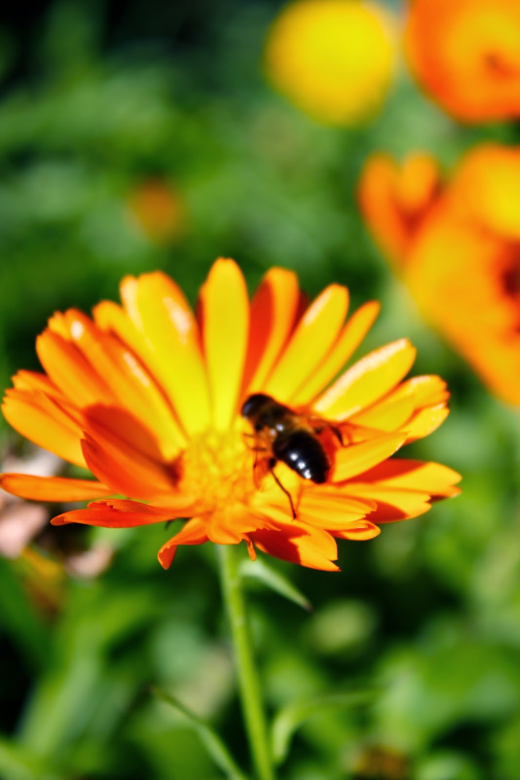
was drawn to. I found Magenta and Cyan particularly hard to locate. Where as, reds, yellows, blues, greens and blacks were much easy to come across. I had my camera set on manual so I could adjust my settings to enhance the colour of the images I would be taking.
I learned that if my camera settings of contrast and vivdness become too high the colour magenta becomes more of red in colour. I took one picture on auto setting and one on manual mode so you can see the difference.
Manual Mode

Auto Mode

After making a contact sheet out of my Saltaire shoot, I realised that I need to focus on the specific images I have been asked to collect rather than the images that interest me. I also need to diversify myself when taking images, to make sure I don’t have multipal shots of the same photo. 


This is a photograph of my friend Michelle’s cyan coloured socks. There is a nice contrast between the green and cyan. The dark shadows within the green background make the cyan stand out more. The curvatures of the feet draw the eyes down towards the centre of the image. There is a sadness to this image, for me it has connotations of death and murder. The imperfection’s of the socks adds a realness to the image. The scale is difficult to determine which adds a mystery to the subject matter. This gives it a feel of loneliness, cold and vulnerability. The colour of the socks adds to the coldness and suggests that the person may be cold, adding to the idea of death. There is two subject matters nature which is alive, and the socks which are so out of place that it creates a mystery which in turn creates an uncertainty and can become unsettling for the viewer. 


I chose the second image because it coincides with one of the objectives of the task which was to take a picture of a car. I took into consideration the composition of the image by moving around the car and looking at it from different angles. I chose this side of the car as I liked the way the light hit it. I waited for the sun to hit the car at a certain angle in order to bring out the brightness. I like how the light and dark curves within the image give the illusion of speed and power. The lines within the image give it definition and depth. To me this car looks likes it could go really fast.  I like the reflection of the pavement which is empty and to me this links to people becoming reliant on vehicles to transport them and how now pavements are often empty. The colour of the car is so vibrant and reflects how warm it was on the day of the shoot, I think I have captured that warmth of that day in this image. 

Day out around Thornton and Ogden (Last Shoot)

Day out around Thornton and Ogden 


Towards the end of the project I felt I didn't have enough images to select from to produce my final grids. I decided to venture out into my local area and capture the beautiful diverse place that Thornton has to offer. This also adds a personal aspect to my work giving it more meaning to me as an individual. I didn't just venture around the village that day I also took a short trip to Ogden waters where I often walk my dog. Throughout the project so far nature has been a feature throughout my work as I feel more drawn to the subject matter. This is prehaps a reflection of the environment I have grown up in. In this project based in colour I find myself thinking more about nature. 


As I walked around Ogden I I played with the features on my camera, keeping the vividness and contrast up slightly as I wanted the colours of the natural environment to stand out. My aim was to over exagerate the colours. I found that if I increased my shutter speed to give less of an exposure the colour within the image stood out more. Making the image darker gave a better contrast which led to the rich lush green colour within my image. The image above is the result of this process and is the strongest well composed image I felt I took that day in regards to the colour green. The image itself has been cropped because my four legged best friends habbit of popping up in the last second of capturing a image led to his head appearing in the very bottom of the photo. I think the light to shadow ratio within this image is well balanced giving it a good contrast. I like the composition of this image with the path cutting through the photo, your eye follows the path, but because there is more green on the left side of the image it gives the impression of going around a corner. Having colour in the sky works as a good contrast and gives a well balanced image. The bold vibrant green gives the feeling of a warm relaxing day. The absence of other people makes for a more sureal environment. Giving the viewer a feeling of peace and surenity. My friend Lucy really wants to go to this place, as she feels happy and warm looking at this image. I feel like im looking in a brochure at an image designed to attract visitors. 

   
In taking this image I found I had to increase my shutter speed to give less of an exposure, because taking a photo in auto mode. For some reason it was giving me a really light washed out image. I think this was due to how bright and sunny it was that day. The less exposed image gave me a much richer colour of cyan and helped to bring out the details of the fence. As there is a lack of light within this image the colour appears bolder. The lines within the image draw your eyes inwards giving it dept. As the background and the forground unfocused it makes the fence stand out and look bigger than it actually is.


Day out around Thornton and Ogden Contact Sheet (Last Shoot)


Day out in Leeds Extra

Day out in Leeds 

Since I started this project I have begun to get into the habit of taking my camera everywhere, so on my trip to Leeds if anything related to this project caught my attention I wouldn't miss the opportunity to capture the moment. I'm glad I did because even though I didn't take many photos they still wouldn't exist hadn't I had my camera. A friend of mine once said photography is about been in the right place at the right time, so from now on my camera is going to be my constant companion. These are the two photos I felt were the best taken that day.

First Shot 

Second Shot

My first reaction was that it looked like the Tardis, I felt I had to capture this moment. I took timing and composition as I didn't want any white cars randomly popping up in my image. I also waited for there to be no people within the frame. I didn't feel that the first picture I took had any contex to it. It felt like something was missing. Upon taking the second photo from the same position by chance this little old lady popped into the frame and I instinctively pressed the shutter. The presence of the woman adds size and distance to the image giving you an idea of scale. The lines within the image that make up the street and the road help to direct you towards the phone booth and down the street. Giving the impression of been on a hill. The women's plain clothing and green bag help with a contrast to the cyan coloured telephone making that the main focus. It also helps to make the colour of the cyan appear more vibrant. The white sky in the background helps to accentuate the colours in the image.


I really love this image; it is defiantly my favourite of the day. The project gave me the confidence to approach this lady as this is something I find difficult. I felt I could relate to this image as I myself have red hair. The colour of her hair drew me to her; she stood out in a crowd of people. It was a miserable day, the white light made her stand out. I felt that if it had been a sunny day the image wouldn't have been as affective, the yellow sunlight would have pulled the focus away from her hair. As soon as I saw her I thought her hair was awesome and I had to ask for a photo. The colour reflected her exciting and loud personality. The darkness of the background in the photo pulled the focus solely on to her. I liked how the woman wasn't directly looking into the camera lens; it’s a very natural look and shows lots of character.    

Day out in Leeds Contact Sheet